SVG Heatmap
Creating a Heatmap SVG to visualize distributions
I have been playing with the Fabric Log Analytics for Analysis Services Engine report template in order to get some insights in query and refresh performance. The data is derived from Analysis Services engine trace events that are collected as part of the Power BI Log Analytics integration. The template provides a a data model and some template visuals to help you understand and manage your Power BI environment. In order to help understand the distribution of data I developed a heatmap SVG.
Tip
The code from this post has been optimized in a another post
Heatmap SVG
I wanted to visualize the query and command CPU and Durations per Semantic Model. My first thought was a box-plot. The problem being is most queries are short, but we really want to identify the longer running queries. With a box plot you get an idea of max, but the IQR and mean/median are all on the low end. A jitter plot allows you to visualize the data points, but there are too many in a small space to be viable. The next thought is a violin plot, as it shows the shape of the entire distribution, but this requires quite a bit of processing to generate. My final thought was to split the distribution into boxes and apply a heatmap to the count of values within each box.
Colour Gradient
To colour the boxes we want to apply a colour gradient. This simple enough if we only care about showing shades of gray. If we take the value to want to convert to gray scale, we can map it from a min-max range to a 0-255 range (255 is largest hex value). We then convert the output value to the corresponding hex value.
// Mapping values range 0 -> 255
VAR _inputStart =    0          // The lowest number of the range input
VAR _inputEnd =      _maxVal    // The largest number of the range input
VAR _outputStart =   255        // The lowest number of the range output
VAR _outputEnd =     0          // The largest number of the range output
VAR _outputVal =     _outputStart + (( _outputEnd - _outputStart ) / ( _inputEnd - _inputStart )) * ( _val - _inputStart )

// https://dax.tips/2019/10/02/dax-base-conversions/
VAR ConvertMe = IFERROR( _outputVal, 255 )
VAR Base = 16
VAR BitTable = GENERATESERIES ( 1, 8 )
VAR DEC2HEX =
    CONCATENATEX(
        BitTable,
        VAR c = MOD( TRUNC ( ConvertMe / POWER ( base, [value] - 1 ) ), base )
        RETURN SWITCH(c,10,"A",11,"B",12,"C",13,"D",14,"E",15,"F",c),
        ,[Value],Desc
    )
VAR HEX = "#" & REPT( RIGHT( DEC2HEX, 2 ), 3 ) & IF( ConvertMe = 255, "00", "" )
RETURN
HEX
I found a great article on how to interpolate from gray scale a colour gradient using SVG filters.
We can go from this.

To this.

By defining and applying the following filter in our SVG definition. You can set the output scale to any colour by taking the RGB values and dividing them by 255. For example, if you have a R value of 50, 50 / 255 = 0.196.
<svg xmlns="http://www.w3.org/2000/svg" width="0" height="0">
    <filter id="blue-red" color-interpolation-filters="sRGB">
    <feComponentTransfer>
        <feFuncR type="table" tableValues="0 1" />
        <feFuncG type="table" tableValues="0 0" />
        <feFuncB type="table" tableValues="1 0" />
    </feComponentTransfer>
    </filter>
</svg>
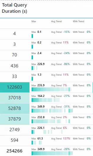
Heatmap
My first approach was to define the number of box, iterate each with GENERATESERIES() and count of the number of values per box, but this resulting in multiple iterations of the fact table. A much faster approach was to iterate the main table once and divide the value by the max value and truncate the decimal, to define the box. You can just group by the calculated box number to get the count per box, which can then be converted to the required hex.
The visual and dax are given below. As a side note I applied a log scale to help show boxes with smaller counts.
Query Duration Heatmap SVG =
VAR _SvgWidth = 150
VAR _SvgHeight = 20

VAR _numBoxes = 40
VAR _boxWidth = _SvgWidth / _numBoxes

VAR _range =
    MAXX(
        ALLSELECTED( ExecutionMetrics[XmlaRequestId] )
        ,CALCULATE(
            SUM( ExecutionMetrics[durationMs] ) / 1000
            ,ExecutionMetrics[LogAnalyticsCategory]= "Query"
            ,ALLSELECTED( Artifact )
        )
    )
VAR _values =
    ADDCOLUMNS(
        VALUES( ExecutionMetrics[XmlaRequestId] )
        ,"@Val"
        ,CALCULATE(
            SUM( ExecutionMetrics[durationMs] ) / 1000
            ,ExecutionMetrics[LogAnalyticsCategory]= "Query"
        )
    )
VAR _minVal =           MINX( _values, [@val] )
VAR _maxVal =           MAXX( _values, [@val] )
VAR _medianVal =        MEDIANX( _values, [@val] )
VAR _avgVal =           AVERAGEX( _values, [@val] )
VAR _assignBoxes =      ADDCOLUMNS( _values , "@box" , IF( not ISBLANK( [@val] ), INT( ([@val] / _range) * (_numBoxes - 1 )) + 1 ) )
VAR _countPerBox =
    ADDCOLUMNS(
        SUMMARIZE( _assignBoxes, [@box] )
        ,"@x", ( [@box] * _boxWidth ) - _boxWidth
        ,"@cnt",
            VAR _box =  [@box]
            RETURN
            CALCULATE( COUNTX ( _assignBoxes, IF( [@box] = _box && _box <> 0, 1 ) ) )
    )
VAR _cntRange = MAXX( _countPerBox, [@cnt] )
VAR _boxes =
    CONCATENATEX(
        ADDCOLUMNS(
            _countPerBox
            ,"@Boxes"
            ,// Mapping values range 0 -> 255
            VAR _inputStart =           0                           // The lowest number of the range input
            VAR _inputEnd =             LOG( _cntRange, 10 )        // The largest number of the range input
            VAR _outputStart =          255                         // The lowest number of the range output
            VAR _outputEnd =            0                           // The largest number of the range output
            VAR _outputVal =            _outputStart + ((_outputEnd - _outputStart) / (_inputEnd - _inputStart)) * ( LOG( [@cnt], 10 ) - _inputStart)

            // https://dax.tips/2019/10/02/dax-base-conversions/
            VAR ConvertMe = IFERROR( _outputVal, 255 )
            VAR Base = 16
            VAR BitTable = GENERATESERIES ( 1, 8 )
            VAR DEC2HEX =
                CONCATENATEX(
                    BitTable,
                    VAR c = MOD( TRUNC ( ConvertMe / POWER ( base, [value] - 1 ) ), base )
                    RETURN SWITCH(c,10,"A",11,"B",12,"C",13,"D",14,"E",15,"F",c),
                    ,[Value],Desc
                )
            VAR HEX = "#" & REPT( RIGHT( DEC2HEX, 2 ), 3 ) & IF( ConvertMe = 255, "00", "" )
            RETURN
            "<rect id='box' x='" & [@x] & "' y='" & _SvgHeight / 2 & "' width='" & _boxWidth & "' height='" & _SvgHeight / 2 & "' fill='" & HEX & "' filter='url(#gradient)'/>"
        )
        ,[@Boxes]
    )

// Trends
var dt = MAX( Dates[Date] )
var _greenHex = "#37A794"
var _redHex = "#DD6B7F"

// Avg Trend
var _MonthAverageAvg =
    CALCULATE(
        AVERAGEX( VALUES( ExecutionMetrics[XmlaRequestId] ), CALCULATE( SUM( ExecutionMetrics[durationMs] ) ) / 1000 )
        ,REMOVEFILTERS( Dates )
        ,DATESINPERIOD( Dates[Date], dt, -1, MONTH )
        ,ExecutionMetrics[LogAnalyticsCategory] = "Query"
    )

var _WeekAverageAvg =
    CALCULATE(
        AVERAGEX( VALUES( ExecutionMetrics[XmlaRequestId] ), CALCULATE( SUM( ExecutionMetrics[durationMs] ) ) / 1000 )
        ,REMOVEFILTERS( Dates )
        ,DATESINPERIOD( Dates[Date], dt, -7, DAY )
        ,ExecutionMetrics[LogAnalyticsCategory] = "Query"
    )
VAR _trendAvg = IF( not ISBLANK( _MonthAverageAvg ), (1 - ( _WeekAverageAvg / _MonthAverageAvg )) * - 1 )
VAR _trendAvgHex = IF( _trendAvg > 0, _redHex, _greenHex )

// 90 Percentile Trend
var _MonthAverage90th =
    CALCULATE(
        PERCENTILEX.INC( VALUES( ExecutionMetrics[XmlaRequestId] ), CALCULATE( SUM( ExecutionMetrics[durationMs] ) ) / 1000, 0.9)
        ,REMOVEFILTERS( Dates )
        ,DATESINPERIOD( Dates[Date], dt, -1, MONTH )
        ,ExecutionMetrics[LogAnalyticsCategory] = "Query"
    )
var _WeekAverage90th =
    CALCULATE(
        PERCENTILEX.INC( VALUES( ExecutionMetrics[XmlaRequestId] ), CALCULATE( SUM( ExecutionMetrics[durationMs] ) ) / 1000, 0.9)
        ,REMOVEFILTERS( Dates )
        ,DATESINPERIOD( Dates[Date], dt, -7, DAY )
        ,ExecutionMetrics[LogAnalyticsCategory] = "Query"
    )
VAR _trend90th = IF( not ISBLANK( _MonthAverage90th ), (1 - ( _WeekAverage90th / _MonthAverage90th )) * - 1 )
VAR _trend90thHex = IF( _trend90th > 0, _redHex, _greenHex )

// https://expensive.toys/blog/svg-filter-heat-map
VAR _svg =
    "data:image/svg+xml;utf8, <svg width=""" & _SvgWidth & """ height=""" & _SvgHeight &""" xmlns="http://www.w3.org/2000/svg">" &
    "<defs>
        <filter id=""gradient"" color-interpolation-filters=""sRGB"">
            <feComponentTransfer>
                <feFuncR type=""table"" tableValues=""0.020 0.975"" />
                <feFuncG type=""table"" tableValues="" 0.776 0.975"" />
                <feFuncB type=""table"" tableValues=""0.733 0.975"" />
            </feComponentTransfer>
        </filter>
    </defs>" &
    _boxes &
    "<text x='0' y='7' fill='black' font-size='6' font-family='Segoe UI, sans-serif'>Max</text>" &
    "<text x='15' y='7' fill='black' font-size='7' font-family='Segoe UI, sans-serif' font-weight='bold'>" & FORMAT(_maxVal, "0.0") & "</text>" &
    "<text x='50' y='7' fill='black' font-size='6' font-family='Segoe UI, sans-serif'>Avg Trend</text>" &
    "<text x='80' y='7' fill='" & _trendAvgHex & "' font-size='7' font-family='Segoe UI, sans-serif' font-weight='bold'>" & FORMAT(_trendAvg, "0%") & "</text>" &
    "<text x='105' y='7' fill='black' font-size='6' font-family='Segoe UI, sans-serif'>90th Trend</text>" &
    "<text x='140' y='7' fill='" & _trend90thHex & "' font-size='7' font-family='Segoe UI, sans-serif' font-weight='bold'>" & FORMAT(_trend90th, "0%") & "</text>" &
    // "<line x1='" & ( _avgVal / _range ) * _SvgWidth  & "' y1='13' x2='" & ( _avgVal / _range ) * _SvgWidth  & "' y2='18' style='stroke:red;stroke-width:2' />" &
    "</svg>"

RETURN
IF( not ISBLANK( _maxVal ), _svg )