Stealing Performance from Sparklines
Using the ad hoc measures created by sparklines to optimize SVG generating measures
In this blog post I walk through my discovery of the implementation of Power BI sparklines, and what can be learned in aid of optimizing SVG measures.
Discovery
I was expanding on the Fabric Log Analytics for Analysis Services Engine report template, by creating a barcode SVG visual to visualize refresh successes and failures.
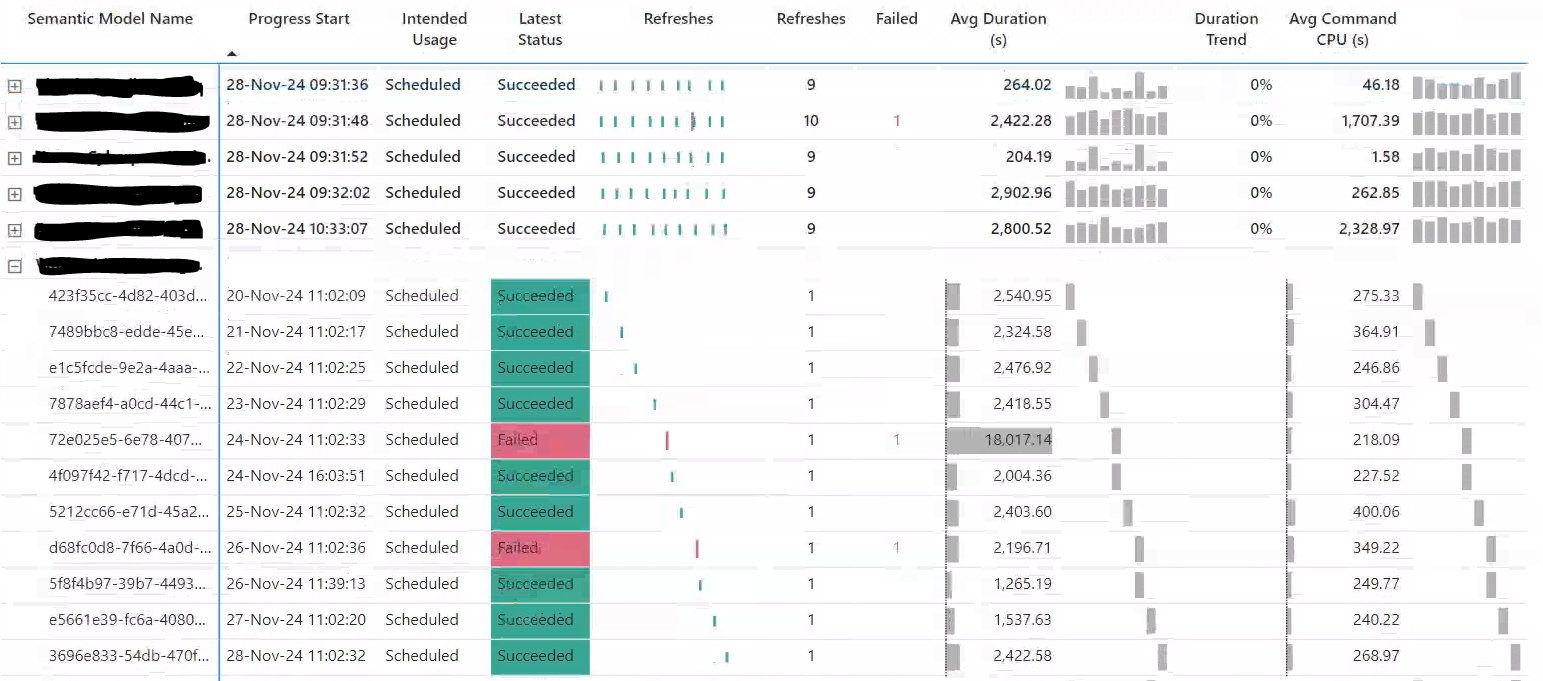
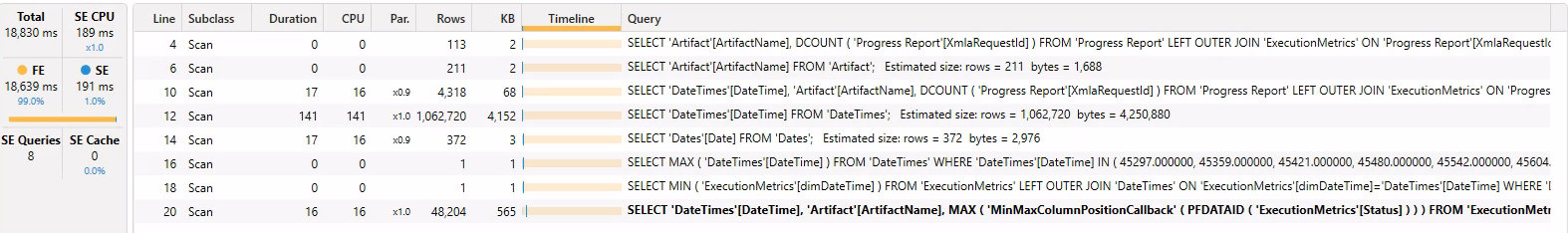
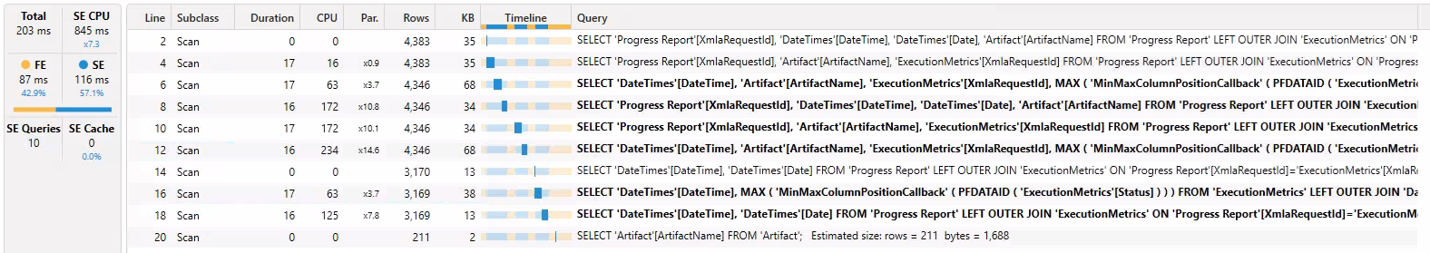
The measure was working fine locally so I pushed it to the service to a fully hydrated model, and the performance was terrible. So fired up DAX studio to perform some optimization, and ran the visual's DAX query (see below). By chance the visual had a couple of sparklines. I was surprised to see that the sparklines were measures defined in the query, and produced a output similar to that of a SVG, with list x,y coordinates. I investigated further and found that SQLBI's Alberto has a video exploring sparkline measures and they seem close to optimal, so I decided to steal and adjust the code for my purposes.
DEFINE MEASURE 'Progress Report'[Sparkline] =
// USER DAX BEGIN
VAR __Categories =
    VALUES('DateTimes'[Date])
VAR __Data =
    ADDCOLUMNS(
        KEEPFILTERS(
            FILTER(
                KEEPFILTERS(__Categories),
                NOT(ISBLANK('Progress Report'[Avg Cmd Duration (s) Refresh]))
            )
        ),
        "ScalarKey", 'DateTimes'[Date],
        "Value", 'Progress Report'[Avg Cmd Duration (s) Refresh]
    )
RETURN
    IF(
        ISEMPTY(__Data),
        BLANK(),
        VAR __All_Categories =
            SELECTCOLUMNS(
                KEEPFILTERS(
                    CALCULATETABLE(
                        ADDCOLUMNS(
                            KEEPFILTERS(
                                FILTER(
                                    KEEPFILTERS(VALUES('DateTimes'[Date])),
                                    AND(
                                        NOT(ISBLANK('Progress Report'[Avg Cmd Duration (s) Refresh])),
                                        NOT(ISBLANK('DateTimes'[Date]))
                                    )
                                 )
                            ),
                            "ScalarKey", 'DateTimes'[Date]
                        ),
                        ALLSELECTED()
                    )
                ),
                "ScalarKey", [ScalarKey]
            )
        VAR __Sample_Categories =
            SAMPLE(53, __All_Categories, [ScalarKey], 1)
        VAR __Min_Interval =
            MINX(
                KEEPFILTERS(__Sample_Categories),
                VAR __Previous =
                    MAXX(
                        KEEPFILTERS(
                            FILTER(KEEPFILTERS(__Sample_Categories), [ScalarKey] < EARLIER([ScalarKey], 1))
                        ),
                        [ScalarKey]
                    )
                    RETURN IF(ISBLANK(__Previous), BLANK(), [ScalarKey] - __Previous)
            )
        VAR __Sync_Data =
            NATURALINNERJOIN(
                __Sample_Categories,
                __Data
            )
        VAR __MinY_Value = MINX(KEEPFILTERS(__Sync_Data), [Value])
        VAR __MaxY_Value = MAXX(KEEPFILTERS(__Sync_Data), [Value])
        VAR __RangeY = (__MaxY_Value - __MinY_Value)
        VAR __MinX_Value = MINX(KEEPFILTERS(__Sample_Categories), [ScalarKey])
        VAR __MaxX_Value = MAXX(KEEPFILTERS(__Sample_Categories), [ScalarKey])
        VAR __Non_Blank_Sync_Data =
            FILTER(
                KEEPFILTERS(__Sync_Data),
                    NOT(ISBLANK([Value]))
                )
        VAR __Result =
            ("{""p"":[" &
                CONCATENATEX(
                    __Sync_Data,
                    ("[" &
                    FORMAT([ScalarKey], "General Number", "en-US") &
                    IF(
                        ISBLANK([Value]),
                        "",
                        CONCATENATE(",", FORMAT(DIVIDE([Value] - __MinY_Value, __RangeY, 0) * 100, "0.0", "en-US"))
                    ) &
                     "]"),
                    ",",
                    [ScalarKey],
                    ASC
                ) &
            "],""yl"":" &
            FORMAT(__MinY_Value, "General Number", "en-US") &
            ",""yh"":" &
            FORMAT(__MaxY_Value, "General Number", "en-US") &
            ",""xl"":" &
             FORMAT(__MinX_Value, "General Number", "en-US") &
            ",""xh"":" &
            FORMAT(__MaxX_Value, "General Number", "en-US") &
            IF(
                ISBLANK(__Min_Interval),
                "",
                CONCATENATE(",""md"":", FORMAT(__Min_Interval, "General Number", "en-US"))
            ) &
            "}")
        RETURN IF( ISEMPTY(__Non_Blank_Sync_Data), BLANK(), __Result )
    )
// USER DAX END

VAR __DS0Core =
    SUMMARIZECOLUMNS(
        'Artifact'[ArtifactName],
        "Refresh_Barcode_SVG", 'Progress Report'[Refresh Barcode SVG],
        "Sparkline", 'Progress Report'[Sparkline]
    )
VAR __DS0PrimaryWindowed =
    TOPN(101, __DS0Core, 'Artifact'[ArtifactName], 1)

EVALUATE
    __DS0PrimaryWindowed
ORDER BY
    'Artifact'[ArtifactName]
Creating the measure
There seem to be a couple of forms of the sparkline measures, the one above that uses ScalarKey and CROSSJOIN(), and another that uses a GroupIndex and SUBSTITUTEWITHINDEX. The latter is used when more than one value is used for the categories on the Y axis if the sort order of a field depends on another field. I used the latter one, resulting in the following:
Refresh SVG Barcode =
VAR __svgHeight = 20
VAR __svgWidth = 150
VAR __Categories = SUMMARIZE( 'Progress Report', 'DateTimes'[Date], 'DateTimes'[DateTime], 'Progress Report'[XmlaRequestId] )
VAR __Data =
    ADDCOLUMNS(
        KEEPFILTERS(
            FILTER(
                KEEPFILTERS( __Categories ),
                not ISBLANK( CALCULATE ( MAX( 'ExecutionMetrics'[Status] ) ) )
            )
        ),
        "Value", CALCULATE ( MAX( 'ExecutionMetrics'[Status] ) )
    )
VAR __All_Categories =
    CALCULATETABLE(
        FILTER(
            KEEPFILTERS( SUMMARIZE( 'Progress Report', 'DateTimes'[Date], 'DateTimes'[DateTime] ) ),
            not ISBLANK( CALCULATE ( MAX( 'ExecutionMetrics'[Status] ) ) ) && not ISBLANK( 'DateTimes'[Date] )
        ),
        ALLSELECTED()
    )
VAR __Sync_Data =
    SUBSTITUTEWITHINDEX(
        __Data
        ,"GroupIndex", __All_Categories
        ,'DateTimes'[DateTime], ASC
    )
VAR __Non_Blank_Sync_Data = FILTER( KEEPFILTERS( __Sync_Data ), not ISBLANK( [Value] ) )
VAR __MinX_Value = 0
VAR __MaxX_Value = COUNTROWS( __All_Categories ) - 1
VAR __RangeX = __MaxX_Value - __MinX_Value
VAR __Lines =
    CONCATENATEX(
        __Sync_Data,
        VAR __Value =
            SWITCH(
                [Value]
                ,"Started", 1
                ,"Succeeded", 0.7
                ,"Failed", 0.85
                ,0
            )
        VAR _Hex =
            SWITCH(
                [Value]
                ,"Started","#FFB900"       // Orange
                ,"Failed", "#DD6B7F"       // Red
                ,"Succeeded", "#37A794"    // Green
                ,"gray"
            )
        VAR _x = FORMAT( DIVIDE( [GroupIndex] - __MinX_Value, __RangeX, 0 ) * 100, "0.0", "en-US" )
        RETURN
        "<line x1='" & _x & "' y1='" & __svgHeight * __Value & "' x2='" & _x & "' y2='" & __svgHeight - (__svgHeight * __Value) & "' stroke='" & _Hex & "' stroke-width='2' />"
        ,",", [value], ASC
    )
VAR __Svg =
    "data:image/svg+xml;utf8, <svg width=""" & __svgWidth & """ height=""" & __svgHeight &""" xmlns="http://www.w3.org/2000/svg">" &
    __Lines &
    "</svg>"
RETURN
IF( not ISEMPTY(__Data) && not ISEMPTY( __Non_Blank_Sync_Data ), __Svg )
Performance
All that was left was to test performance, you can see my first attempt was not great, using a lot of formula engine and creating large data cache. The version using the sparkline backbone had fantastic performance.
Conclusion
This backbone query used by sparklines is well designed and can and should be used for the generation of SVG visuals.