SVG Violin Plot
Creating a SVG Violin to visualize distributions in Power BI
In my previous post I created a heat map SVG visual to visualize data distributions. In that post I mentioned Violin plots, in this post I describe how to create one.
Violin Plots
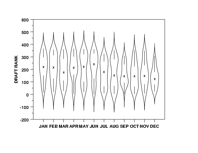
Firstly, what are Violin Plots? Violin plot show the distribution of data points, with the width of the curve estimating the density of points in a region. This allows the visualization multimodal data (more than one peak). These tend to be accompanied with a Box Plot to provide addition information and context. The curves of the Violin Plot are calculated using Kernel Density Estimation (KDE).
Kernel Density Estimation (KDE)
In KDE data points are converted into kernels, where each point is represented by a distribution (normal, uniform, gaussian etc.). In the case of the normal distribution each point represents a mean (center of the curve), and the standard deviation can be used to expand the width of the distribution, allowing for smoothing. The data is sampled at uniform points across the range of the data, and the contribution each point is summed. I found this video to provide a good description.

Paths and Bézier Curves
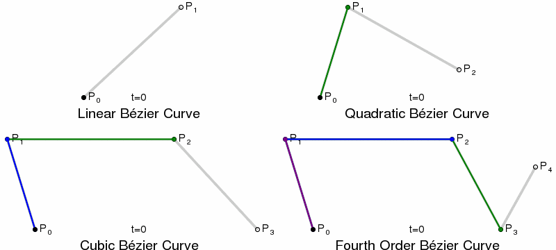
Once we have calculated our KDE, we need to plot the curves. This is done using SVG paths, using Bézier Curves. Bézier Curves are defined by start and end point, plus 1 or more control points, which act like gravity pulling the curve towards them. Quadratic Bézier Curves have a single control point, Cubic have two, and so on.
In SVG paths the cubic curve is specified by C x1 y1, x2 y2, x yor a short-hand S x2 y2, x ywhich assumes the first control point is a reflection of the one used previously in the path.
End Result
Taking all the concept above, we can now generate a Violin Plot. The level of sampling and bandwidth will have to be adjusted to fit your data.
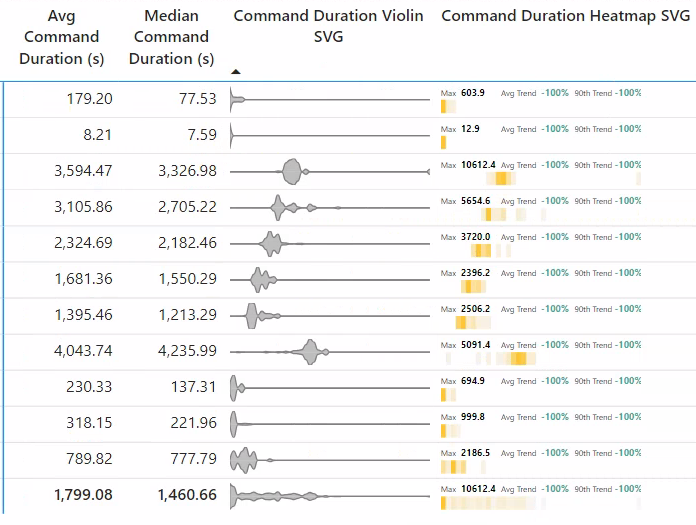
Command Duration Violin SVG =
VAR _SvgWidth = 150
VAR _SvgHeight = 20

VAR _samples = 50
VAR _bandwidth = 60 // Kernal width, adjust to avoid over or under fitting

VAR _range =
    MAXX(
        ALLSELECTED( ExecutionMetrics[XmlaRequestId] )
        ,CALCULATE(
            SUM( ExecutionMetrics[durationMs] ) / 1000
            ,ExecutionMetrics[LogAnalyticsCategory]= "Command"
            ,ALLSELECTED( Artifact )
        )
    )
VAR _rangePerSample = _range / _samples
VAR _values =
    ADDCOLUMNS(
        CALCULATETABLE(
            VALUES( ExecutionMetrics[XmlaRequestId] )
            , not ISBLANK( ExecutionMetrics[durationMs] )
            , ExecutionMetrics[LogAnalyticsCategory]= "Command"
        )
        ,"@Val", CALCULATE( SUM( ExecutionMetrics[durationMs] ) / 1000, ExecutionMetrics[LogAnalyticsCategory]= "Command" )
    )
VAR _numValues = COUNTAX( _values, [@Val] )
VAR _KDE = // Kernal Density Estimation
    ADDCOLUMNS(
        GENERATESERIES( 0, _samples + 1, 1 )
        ,"@inputX", _rangePerSample * [Value]
        ,"@KDE", ( 1 / _numValues ) * SUMX( _values, NORM.DIST( _rangePerSample * [Value], [@val], _bandwidth, false ) ) // Normal distribution for Kernal (Gaussian, Uniform, Triangular etc.)
    )
VAR _maxKDE = MAXX( _KDE, [@KDE] )
VAR _points =
    ADDCOLUMNS(
        _KDE
        ,"@x",
            VAR _xInputStart =           0                         // The lowest number of the range input
            VAR _xInputEnd =             _range                    // The largest number of the range input
            VAR _xOutputStart =          0                         // The lowest number of the range output
            VAR _xOutputEnd =            _SvgWidth                 // The largest number of the range output
            VAR _xOutputVal =            _xOutputStart + ((_xOutputEnd - _xOutputStart) / (_xInputEnd - _xInputStart)) * ( [@inputX] - _xInputStart)
            RETURN
            _xOutputVal
        ,"@y",
            VAR _yInputStart =           0                         // The lowest number of the range input
            VAR _yInputEnd =             _maxKDE                   // The largest number of the range input
            VAR _yOutputStart =          _SvgHeight / 2            // The lowest number of the range output
            VAR _yOutputEnd =            0                         // The largest number of the range output
            VAR _yOutputVal =            _yOutputStart + ((_yOutputEnd - _yOutputStart) / (_yInputEnd - _yInputStart)) * ([@KDE] - _yInputStart)
            RETURN
            _yOutputVal
    )
VAR _pointsAndPreviousPoint =
    NATURALLEFTOUTERJOIN(
        _points
        ,SELECTCOLUMNS(
            _points
            ,"Value", [Value] + 1
            ,"@prevX", [@x]
            ,"@prevY", [@y]
        )
    )
VAR _plusControlPoint = // Calculate control point for cubic Bézier curve. Assumes they half way between points, at the same height as the current point
    ADDCOLUMNS(
        _pointsAndPreviousPoint
        ,"@cx", [@prevX] + (([@x] - [@prevX]) / 2)
        ,"@cy", [@y]
    )
VAR _topCurves =
    CONCATENATEX(
        _plusControlPoint
        ,"S " & [@cx] & " " & [@cy] & ", " & [@x] & " " & [@y] // cubic Bézier curve
        , " "
        , [Value]
)
VAR _bottomCurves = // top curve inverted
    CONCATENATEX(
        _plusControlPoint
        ,"S " & [@cx] & " " & (_SvgHeight / 2) - ([@cy] - (_SvgHeight / 2)) & ", " & [@x] & " " & (_SvgHeight / 2) - ([@y] - (_SvgHeight / 2))
        , " "
        , [Value]
)
VAR _svg =
    "data:image/svg+xml;utf8, <svg width=""" & _SvgWidth & """ height=""" & _SvgHeight &""" xmlns="http://www.w3.org/2000/svg">" &
    "<path d=' M 0 " & (_SvgHeight / 2) & " " & _topCurves & "M " & _SvgWidth & " " & (_SvgHeight / 2) & "' stroke='gray' fill='gray' fill-opacity='50%'/>" &
    "<path d=' M 0 " & (_SvgHeight / 2) & " " & _bottomCurves & "M " & _SvgWidth & " " & (_SvgHeight / 2) & "' stroke='gray' fill='gray' fill-opacity='50%'/>" &
    "</svg>"
RETURN
IF( not ISBLANK( _maxKDE ), _svg )
Conclusion
This visual is more well known than the previous heatmap, so might be more parsable by end users. This comes at the cost of some extra computation. In any case the generation of this visuals involves some interesting concepts that are worth finding more about.