Graphing DAX Query Plans
Using Vega Force Directed Graphs to visualizing DAX Query Plans
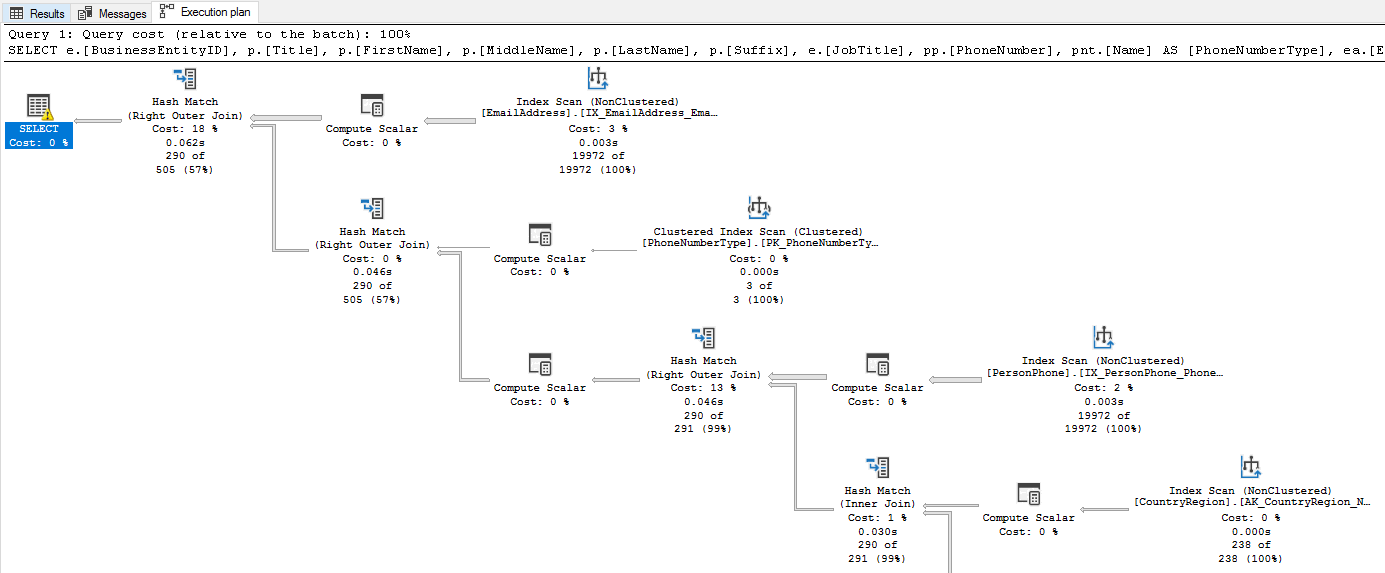
Ever since completing SQLBI's Optimizing DAX course I started looking at DAX query plans in more depth. I've found the fully textual plans hard to parse, with only indents to denote nested operations. This is fine until you get multiple paths nested below the same node, it hard to keep the full execution plan in your head. I've always liked SQL servers graphical query plans so I want to investigate how to build the same.
Query
We are going to be looking at the execution of the following query, from a previous post.
SQL Server Profiler
The Query Plan can be obtained from running SQL Server Profiler and grabbing the DAX Query Plan event.
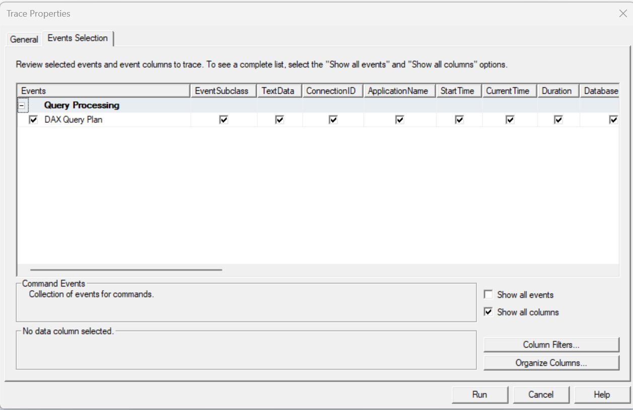
Clear Cache
Clear cache prior to query execution to avoid using the cache
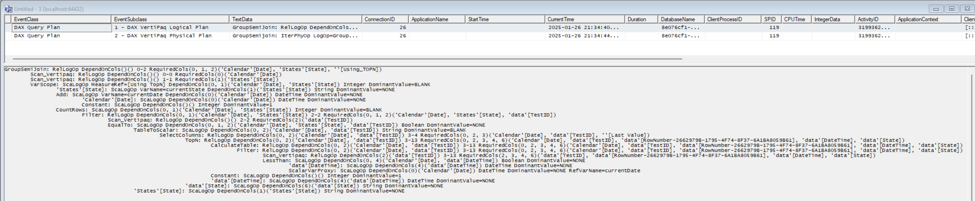
When we run our query we see two events, the Logical query plan and the Physical query plan. The SQLBI guys go into detail on DAX query plans in their Optimizing DAX course, plus they also have a white paper on the subject. The Logical Query Plan is created first, and resembles the DAX query. This is then converted the Physical Plan for execution. We can see a number of rows with increasing indent. Each increase in indent represents a nested operation. So we need to read the plan from the leaf to the root to understand how data stored in SSAS Tabular is being processed to return the output of the query.
My main bugbear with this is that if you have several groups of operations that all use the same step, it can be quite hard to keep track of all the interactions. What I'd really like is a graphical view like you get from SQL Server.
Lets save this trace: File > Save As > Trace XML File... > trace.xml
Processing XML Trace
We now need to process the XML to generate the appropriate data structure to generate a graph.
import xmltodict
import json
import re

# XML to dict
EventSubClass ={
    1: 'logical',
    2: 'physical'
}
queries = {}

with open('trace.xml', encoding='utf-16') as fd:
    queryPlan = xmltodict.parse(fd.read(), encoding='utf-16')

for event in queryPlan['TraceData']['Events']['Event']:
    if event['@name'] == 'DAX Query Plan':

        for column in event['Column']:

            if column['@name'] == 'TextData':
                query = column['#text']

            if column['@name'] == 'EventSubclass':
                queryType = EventSubClass[int(column['#text'])]

        queries[queryType] = query

# Generate Graph
def extract_records(line) -> int:
    match = re.search(r'#Records=(\d+)', line)
    if match:
        return int(match.group(1))
    return None

def extract_operation_type(line) -> list:
    match = re.search(r'(.*): (\w*)', line)
    if match:
        return [match.group(1).strip(), match.group(2).strip()]
    return None

def generate_graph(lines: list)->list:
    stack = []
    level_parents = {}
    graph = []

    for index, line in enumerate(lines):
        current_level = len(line) - len(line.lstrip())

        while len(stack) > current_level:
            stack.pop()

        parent_index = level_parents.get(current_level - 1, None)

        stack.append((index, line))

        level_parents[current_level] = index

        operationType = extract_operation_type(line)

        graph.append({
            'srcid': parent_index,
            'dstid': index,
            'operation': line.strip(),
            'operationShort': operationType[0],
            'operationType': operationType[1],
            'isCache': operationType[0] == 'Cache',
            'level': current_level,
            'records': extract_records(line)
        })

    return graph

graphs = {}

for queryType, query in queries.items():
    graphs[queryType] = generate_graph(lines = query.split('\n'))

with open('queryPlan.json', 'w') as fp:
    json.dump(graphs, fp)
{
  "logical": [
    {
      "srcid": null,
      "dstid": 0,
      "operation": "GroupSemiJoin: RelLogOp DependOnCols()() 0-2 RequiredCols(0, 1, 2)('Calendar'[Date], 'States'[State], ''[Using_TOPN])",
      "operationShort": "GroupSemiJoin",
      "operationType": "RelLogOp",
      "isCache": false,
      "level": 0,
      "records": null
    },
    {
      "srcid": 0,
      "dstid": 1,
      "operation": "Scan_Vertipaq: RelLogOp DependOnCols()() 0-0 RequiredCols(0)('Calendar'[Date])",
      "operationShort": "Scan_Vertipaq",
      "operationType": "RelLogOp",
      "isCache": false,
      "level": 1,
      "records": null
    },
    ...
  ],
  "physical": [
    {
      "srcid": null,
      "dstid": 0,
      "operation": "GroupSemijoin: IterPhyOp LogOp=GroupSemiJoin IterCols(0, 1, 2)('Calendar'[Date], 'States'[State], ''[Using_TOPN])",
      "operationShort": "GroupSemijoin",
      "operationType": "IterPhyOp",
      "isCache": false,
      "level": 0,
      "records": null
    },
    {
      "srcid": 0,
      "dstid": 1,
      "operation": "Spool_Iterator<SpoolIterator>: IterPhyOp LogOp=VarScope IterCols(0, 1)('Calendar'[Date], 'States'[State]) #Records=13413 #KeyCols=2 #ValueCols=1",
      "operationShort": "Spool_Iterator<SpoolIterator>",
      "operationType": "IterPhyOp",
      "isCache": false,
      "level": 1,
      "records": 13413
    },
    ...
  ]
}
Graphs
We can now use Vega to draw the graph.
Logical Query Plan
{
  "$schema": "https://vega.github.io/schema/vega/v5.json",
  "description": "A force-directed graph for a DAX Query Plan",
  "width": 700,
  "height": 500,
  "padding": 5,
  "autosize": "none",
  "background": "#263238",
  "signals": [
    {"name": "cx", "update": "width / 2"},
    {"name": "cy", "update": "height / 2"},
    {"name": "nodeRadius", "value": 8},
    {"name": "nodeCharge", "value": -30},
    {"name": "linkDistance", "value": 30},
    {"name": "static", "value": false},
    {"name": "gravityX", "value": 0.2},
    {"name": "gravityY", "value": 0.9},
    {
      "description": "State variable for active node fix status.",
      "name": "fix",
      "value": false,
      "on": [
        {
          "events": "symbol:pointerout[!event.buttons], window:pointerup",
          "update": "false"
        },
        {"events": "symbol:pointerover", "update": "fix || true"},
        {
          "events": "[symbol:pointerdown, window:pointerup] > window:pointermove!",
          "update": "xy()",
          "force": true
        }
      ]
    },
    {
      "description": "Graph node most recently interacted with.",
      "name": "node",
      "value": null,
      "on": [
        {
          "events": "symbol:pointerover",
          "update": "fix === true ? item() : node"
        }
      ]
    },
    {
      "description": "Flag to restart Force simulation upon data changes.",
      "name": "restart",
      "value": false,
      "on": [{"events": {"signal": "fix"}, "update": "fix && fix.length"}]
    }
  ],
  "data": [
    {
      "name": "node-data",
      "url": "https://raw.githubusercontent.com/EvaluationContext/evaluationcontext.github.io/refs/heads/master/assets/vega/0020-queryPlanGraph/queryPlan.json",
      "format": {"type": "json", "property": "logical"},
      "transform": [
        {
          "type": "project",
          "fields": ["dstid", "operation", "level", "records", "operationType", "operationShort"],
          "as": ["index", "Operation", "Level", "Records"]
        },
        {
              "type": "formula",
              "expr": "length(datum.operationShort) * (width / 160)",
              "as": "operationShortLen"
        }
      ]
    },
    {
      "name": "link-data",
      "url": "https://raw.githubusercontent.com/EvaluationContext/evaluationcontext.github.io/refs/heads/master/assets/vega/0020-queryPlanGraph/queryPlan.json",
      "format": {"type": "json", "property": "logical"},
      "transform": [
        {"type": "filter", "expr": "datum.srcid != null"},
        {
          "type": "project",
          "fields": ["srcid", "dstid"],
          "as": ["source", "target"]
        }
      ]
    }
  ],

  "legends": [
    {
      "direction": "vertical",
      "legendX": 1050,
      "legendY": 0,
      "orient": "none",
      "stroke": "color",
      "fill": "color",
      "titleColor": "#b6bcdd",
      "padding": 10,
      "encode": {
        "title": { "update": { "fontSize": { "value": 14 } } },
        "symbols": { "update": { "fillOpacity": { "value": 0.4 } } },
        "labels": {
          "update": {
            "fontSize": { "value": 12 },
            "fill": { "value": "#b6bcdd" }
          }
        }
      }
    }
  ],

  "scales": [
    {
      "name": "xscale",
      "type": "band",
      "domain": {"data": "node-data", "field": "Level", "sort": true},
      "paddingOuter": 1,
      "range": "width"
    },
    {
      "name": "yscale",
      "type": "band",
      "domain": {"data": "node-data", "field": "index", "sort": true},
      "range": "height"
    },
    {
      "name": "color",
      "type": "ordinal",
      "domain": {"data": "node-data", "field": "operationType"},
      "range": {"scheme": "tableau10"}
    },
    {
      "name": "size",
      "domain": {"data": "node-data", "field": "Records"},
      "range": [300, 2000]
    }
  ],

  "marks": [
    {
      "name": "nodes",
      "type": "symbol",
      "zindex": 1,
      "from": {"data": "node-data"},
      "on": [
        {
          "trigger": "fix",
          "modify": "node",
          "values": "fix === true ? {fx: node.x, fy: node.y} : {fx: fix[0], fy: fix[1]}"
        },
        {"trigger": "!fix", "modify": "node", "values": "{fx: null, fy: null}"}
      ],
      "encode": {
        "enter": {
          "size": {"scale": "size", "field": "Records"},
          "stroke": {"scale": "color", "field": "operationType"},
          "fill": {"scale": "color", "field": "operationType"},
          "fillOpacity": {"value": 0.1},
          "xfocus": {"scale": "xscale", "field": "Level", "band": 0.5},
          "yfocus": {"scale": "yscale", "field": "index", "band": 0.5},
          "tooltip": {
            "signal": "{OperationType: datum.operationType, Operation: datum.Operation, Records: datum.Records}"
          }
        },
        "update": {
          "cursor": {"value": "pointer"}
        }
      },
      "transform": [
        {
          "type": "force",
          "iterations": 300,
          "restart": {"signal": "restart"},
          "static": {"signal": "static"},
          "signal": "force",
          "forces": [
            {"force": "center", "x": {"signal": "cx"}, "y": {"signal": "cy"}},
            {"force": "collide", "radius": {"signal": "nodeRadius"}},
            {"force": "nbody", "strength": {"signal": "nodeCharge"}},
            {
              "force": "link",
              "links": "link-data",
              "distance": {"signal": "linkDistance"},
              "id": "index"
            },
            {"force": "x", "x": "xfocus", "strength": {"signal": "gravityX"}},
            {"force": "y", "y": "yfocus", "strength": {"signal": "gravityY"}}
          ]
        }
      ]
    },
    {
      "type": "path",
      "from": {"data": "link-data"},
      "interactive": false,
      "encode": {
        "update": {"stroke": {"value": "#ccc"}, "strokeWidth": {"value": 0.5}}
      },
      "transform": [
        {
          "type": "linkpath",
          "require": {"signal": "force"},
          "shape": "line",
          "sourceX": "datum.source.x",
          "sourceY": "datum.source.y",
          "targetX": "datum.target.x",
          "targetY": "datum.target.y"
        }
      ]
    },
    {
      "type": "text",
      "name": "labels",
      "from": {"data": "nodes"},

      "zindex": 2,
      "interactive": false,
      "enter": {},
      "encode": {
        "update": {
          "fill": {"signal": "'white'"},
          "y": {"field": "y"},
          "x": {"field": "x"},
          "text": {"field": "datum.operationShort"},
          "align": {"value": "left"},
          "fontSize": {"value": 10},
          "baseline": {"value": "top"},
          "limit": {
            "signal": "clamp(60, 1, 1000)"
          },
          "ellipsis": {"value": " "}
        }
      }
    }
  ]
}
Physical Query Plan
{
  "$schema": "https://vega.github.io/schema/vega/v5.json",
  "description": "A force-directed graph for a DAX Query Plan",
  "width": 700,
  "height": 500,
  "padding": 5,
  "autosize": "none",
  "background": "#263238",
  "signals": [
    {"name": "cx", "update": "width / 2"},
    {"name": "cy", "update": "height / 2"},
    {"name": "nodeRadius", "value": 8},
    {"name": "nodeCharge", "value": -30},
    {"name": "linkDistance", "value": 30},
    {"name": "static", "value": false},
    {"name": "gravityX", "value": 0.2},
    {"name": "gravityY", "value": 0.9},
    {
      "description": "State variable for active node fix status.",
      "name": "fix",
      "value": false,
      "on": [
        {
          "events": "symbol:pointerout[!event.buttons], window:pointerup",
          "update": "false"
        },
        {"events": "symbol:pointerover", "update": "fix || true"},
        {
          "events": "[symbol:pointerdown, window:pointerup] > window:pointermove!",
          "update": "xy()",
          "force": true
        }
      ]
    },
    {
      "description": "Graph node most recently interacted with.",
      "name": "node",
      "value": null,
      "on": [
        {
          "events": "symbol:pointerover",
          "update": "fix === true ? item() : node"
        }
      ]
    },
    {
      "description": "Flag to restart Force simulation upon data changes.",
      "name": "restart",
      "value": false,
      "on": [{"events": {"signal": "fix"}, "update": "fix && fix.length"}]
    }
  ],
  "data": [
    {
      "name": "node-data",
      "url": "https://raw.githubusercontent.com/EvaluationContext/evaluationcontext.github.io/refs/heads/master/assets/vega/0020-queryPlanGraph/queryPlan.json",
      "format": {"type": "json", "property": "physical"},
      "transform": [
        {
          "type": "project",
          "fields": ["dstid", "operation", "level", "records", "operationType", "operationShort"],
          "as": ["index", "Operation", "Level", "Records"]
        },
        {
              "type": "formula",
              "expr": "length(datum.operationShort) * (width / 160)",
              "as": "operationShortLen"
        }
      ]
    },
    {
      "name": "link-data",
      "url": "https://raw.githubusercontent.com/EvaluationContext/evaluationcontext.github.io/refs/heads/master/assets/vega/0020-queryPlanGraph/queryPlan.json",
      "format": {"type": "json", "property": "physical"},
      "transform": [
        {"type": "filter", "expr": "datum.srcid != null"},
        {
          "type": "project",
          "fields": ["srcid", "dstid"],
          "as": ["source", "target"]
        }
      ]
    }
  ],

  "legends": [
    {
      "direction": "vertical",
      "legendX": 1050,
      "legendY": 0,
      "orient": "none",
      "stroke": "color",
      "fill": "color",
      "titleColor": "#b6bcdd",
      "padding": 10,
      "encode": {
        "title": { "update": { "fontSize": { "value": 14 } } },
        "symbols": { "update": { "fillOpacity": { "value": 0.4 } } },
        "labels": {
          "update": {
            "fontSize": { "value": 12 },
            "fill": { "value": "#b6bcdd" }
          }
        }
      }
    }
  ],

  "scales": [
    {
      "name": "xscale",
      "type": "band",
      "domain": {"data": "node-data", "field": "Level", "sort": true},
      "paddingOuter": 1,
      "range": "width"
    },
    {
      "name": "yscale",
      "type": "band",
      "domain": {"data": "node-data", "field": "index", "sort": true},
      "range": "height"
    },
    {
      "name": "color",
      "type": "ordinal",
      "domain": {"data": "node-data", "field": "operationType"},
      "range": {"scheme": "tableau10"}
    },
    {
      "name": "size",
      "domain": {"data": "node-data", "field": "Records"},
      "range": [300, 2000]
    }
  ],

  "marks": [
    {
      "name": "nodes",
      "type": "symbol",
      "zindex": 1,
      "from": {"data": "node-data"},
      "on": [
        {
          "trigger": "fix",
          "modify": "node",
          "values": "fix === true ? {fx: node.x, fy: node.y} : {fx: fix[0], fy: fix[1]}"
        },
        {"trigger": "!fix", "modify": "node", "values": "{fx: null, fy: null}"}
      ],
      "encode": {
        "enter": {
          "size": {"scale": "size", "field": "Records"},
          "stroke": {"scale": "color", "field": "operationType"},
          "fill": {"scale": "color", "field": "operationType"},
          "fillOpacity": {"value": 0.1},
          "xfocus": {"scale": "xscale", "field": "Level", "band": 0.5},
          "yfocus": {"scale": "yscale", "field": "index", "band": 0.5},
          "tooltip": {
            "signal": "{OperationType: datum.operationType, Operation: datum.Operation, Records: datum.Records}"
          }
        },
        "update": {
          "cursor": {"value": "pointer"}
        }
      },
      "transform": [
        {
          "type": "force",
          "iterations": 300,
          "restart": {"signal": "restart"},
          "static": {"signal": "static"},
          "signal": "force",
          "forces": [
            {"force": "center", "x": {"signal": "cx"}, "y": {"signal": "cy"}},
            {"force": "collide", "radius": {"signal": "nodeRadius"}},
            {"force": "nbody", "strength": {"signal": "nodeCharge"}},
            {
              "force": "link",
              "links": "link-data",
              "distance": {"signal": "linkDistance"},
              "id": "index"
            },
            {"force": "x", "x": "xfocus", "strength": {"signal": "gravityX"}},
            {"force": "y", "y": "yfocus", "strength": {"signal": "gravityY"}}
          ]
        }
      ]
    },
    {
      "type": "path",
      "from": {"data": "link-data"},
      "interactive": false,
      "encode": {
        "update": {"stroke": {"value": "#ccc"}, "strokeWidth": {"value": 0.5}}
      },
      "transform": [
        {
          "type": "linkpath",
          "require": {"signal": "force"},
          "shape": "line",
          "sourceX": "datum.source.x",
          "sourceY": "datum.source.y",
          "targetX": "datum.target.x",
          "targetY": "datum.target.y"
        }
      ]
    },
    {
      "type": "text",
      "name": "labels",
      "from": {"data": "nodes"},

      "zindex": 2,
      "interactive": false,
      "enter": {},
      "encode": {
        "update": {
          "fill": {"signal": "'white'"},
          "y": {"field": "y"},
          "x": {"field": "x"},
          "text": {"field": "datum.operationShort"},
          "align": {"value": "left"},
          "fontSize": {"value": 10},
          "baseline": {"value": "top"},
          "limit": {
            "signal": "clamp(60, 1, 1000)"
          },
          "ellipsis": {"value": " "}
        }
      }
    }
  ]
}
Conclusion
I find this way of looking at the query plan much easier to parse and understand. While I'm not fully happy with the visuals they are a good proof of concept, and hopefully the Power BI or Dax Studio teams could consider creating something like this. Please vote on my Fabric idea if you want something like this too.